Overlay Configuration
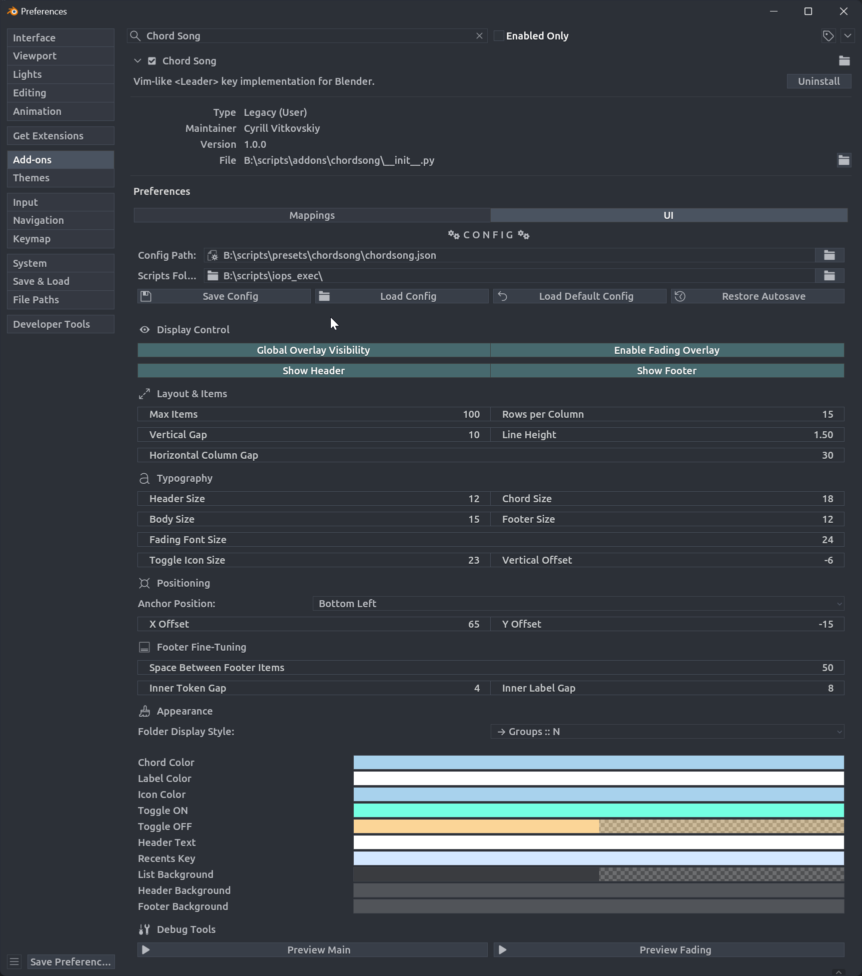
Display Control
- Hide T & N Panels During Leader: Automatically hide Tool (T) and Properties (N) panels while the Leader key modal is active. Panels are restored when the modal finishes.
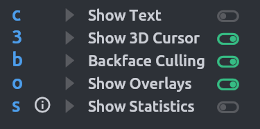
- Global Overlay Visibility: Toggle main overlay.
- Enable Fading Overlay: Show confirmation after executing a chord.
- Show Header: Toggle header.
- Show Footer: Toggle footer.
Panel Hiding
Automatically hides Tool (T) and Properties (N) panels in the active editor (3D Viewport, Node Editor, UV/Image Editor) while any overlay modal is running. Panels are restored to their original state when the modal closes.
Layout & Items
- Max Items: Items per column.
- Column Layout: Rows before wrapping.
- Vertical Gap: Item spacing.
- Line Height: Text line height multiplier.
- Horizontal Column Gap: Column spacing.
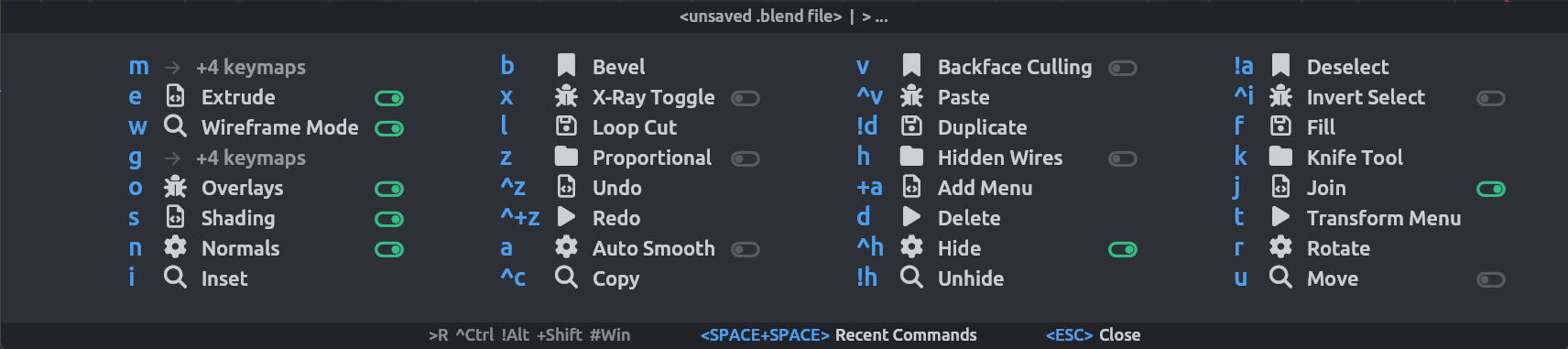
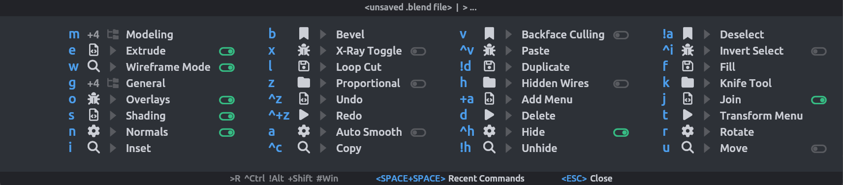
Overlay Sort Order
Controls how chords are sorted in the overlay. Choose a preset or define a custom sort string.
Presets
| Preset | Sort String | Description |
|---|---|---|
| Group → Depth → Index | g d c |
By group display order, then items before folders, then mapping index |
| Depth → Group → Index | d g c |
Items before folders, then by group, then mapping index |
| Group → Index | g c |
By group display order, then mapping index |
| Label | L |
Alphabetically by displayed label |
Custom Sort String
Select Custom to define your own sort string. Tokens are space-separated and evaluated left to right (highest priority first).
Available tokens:
| Token | Description |
|---|---|
D |
Depth (folders first) |
d |
Depth inverted (items first) |
g |
Group by display order |
G |
Group alphabetical (ABC) |
C |
Chord token alphabetical (ABC) |
c |
Chord order index (mapping list position) |
L |
Label alphabetical (for folders: group names; for items: action label) |
n |
Count ascending (fewer items first) |
N |
Count descending (more items first) |
Examples:
g d c— Group by display order, items before folders, then by mapping indexL c— Alphabetical by label, break ties by indexN g c— Biggest folders first, then by group, then indexd G c— Items first, then groups alphabetically, then index
Typography
Enhanced typography controls with separate font sizes for all overlay elements:
- Header Size: Font size for overlay header text
- Chord Size: Font size for chord sequence text
- Body Size: Font size for labels and descriptions
- Footer Size: Font size for footer text
- Fading Font Size: Font size for the confirmation overlay
- Toggle Icon Size: Size of toggle state icons
- Toggle Vertical Offset: Vertical positioning offset for toggle icons
Positioning
Controls overlay position.
- Anchor Position: Corner or edge anchor.
- X Offset, Y Offset: Offset from anchor.
Appearance
Overlay Style Presets
Choose the display style:
- Default: Simple count display (
a → +5 keymaps) - Custom: Custom format strings using tokens.
Custom Format Strings
When Custom style is selected, you can define your own format strings using a token system:
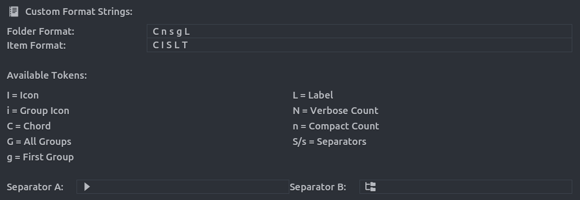
Available Tokens:
C= ChordI= Icon (mapping's icon)i= Group Icon (first group's icon)G= All Groupsg= First Group OnlyL= LabelN= Verbose Count (e.g., "+5 keymaps")n= Compact Count (e.g., "+5")S= Separator A (default:→)-
s= Separator B (default:::) -
Folder Format: Controls how folders (prefixes with multiple mappings) are displayed
- Item Format: Controls how individual chord items are displayed
Example Custom Formats:
- Folder:
C n s g→ Chord Count Separator_B First Group's Label
- Item:
C I S L T→ Chord Icon separator_A Label Toggle
Theme Management
Built-in Presets
- Reset to Default: Restores ChordSong's default color scheme
Extract from Blender Theme
The Match Current Blender Theme button automatically extracts colors from your current Blender theme and applies them to the overlay. This ensures visual consistency with your Blender interface.
Import/Export Themes
- Export: Save your current overlay theme colors to a JSON file for backup or sharing
- Import: Load theme colors from a previously exported JSON file
Testing
Debug Tools in UI tab:
- Preview Main: Main overlay with dummy data.
- Preview Fading: Fading overlay (10s duration).
Click again to hide.